
This is a guest post by Peichao Qin | University of Cambridge.
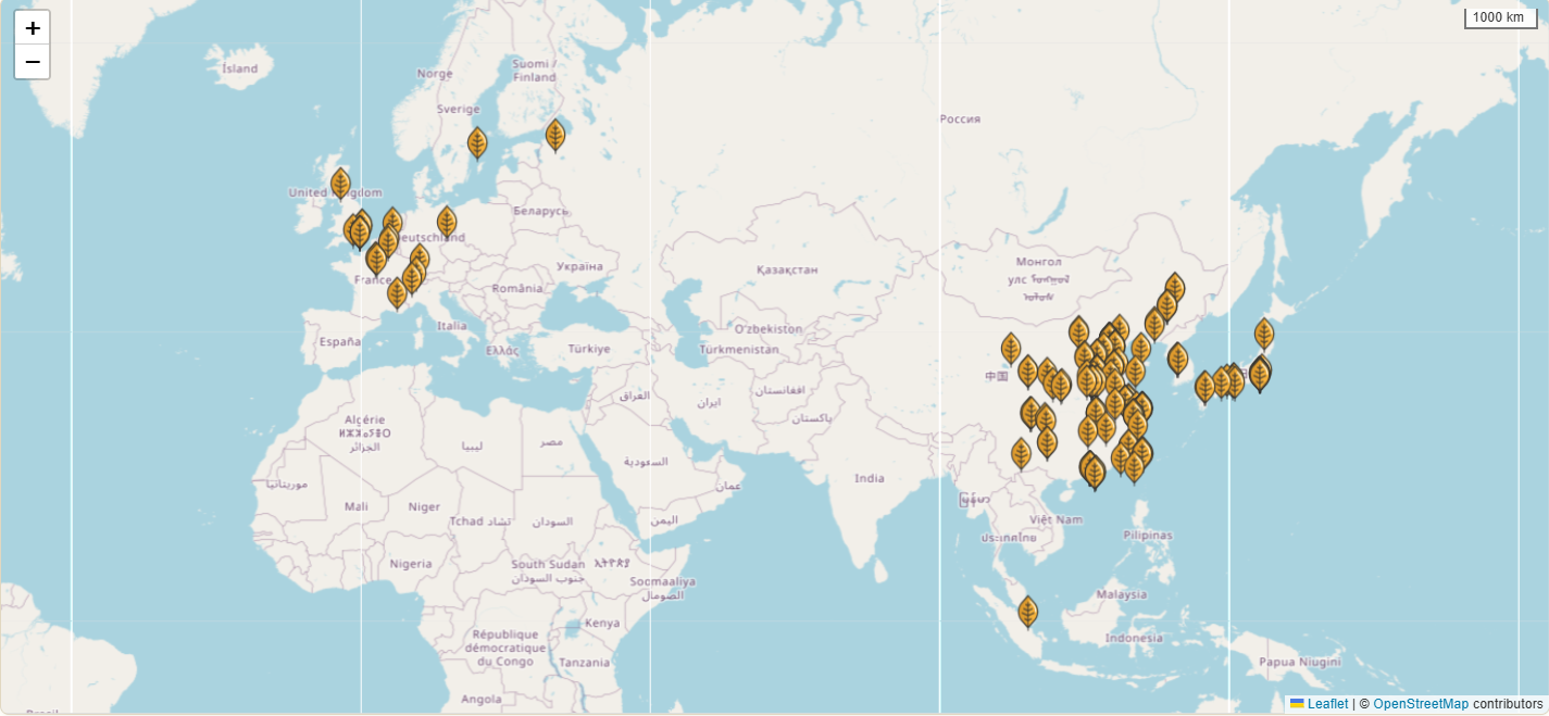
In my earlier post, I introduced my newly launched “Jingyuan Digital Platform” and its capabilities in addressing the challenges of font creation and complex database querying related to Shang dynasty oracle bone inscriptions. In this article, I will delve into another important module of the website: the geographic visualization tool, which facilitates dynamic mapping and analysis of the global distribution of oracle bone collections. This tool, built with the Leaflet.js framework, can provide users with a detailed overview of the total number of materials and their current storage locations spread across over 250 different sites. Using this module from the Jingyuan platform as a practical example, I will outline the essential steps for creating similar interactive maps with Leaflet.js, including relevant code setup and data integration methods for building impactful geospatial visualizations.
Geographic Visualization
Geographic distribution visualization is vital for effectively analyzing and displaying location-sensitive data related to the origins, contexts, and dispersal of ancient artifacts such as oracle bones. It enables users to quickly look up and locate their nearest collections without needing to consult an unsorted array of printed or digital reference materials. Unlike traditional publication formats such as research articles or academic papers, interactive geo-maps provide a more intuitive way to index geographic information and facilitate the exploration of the precise distribution of artifact repositories.
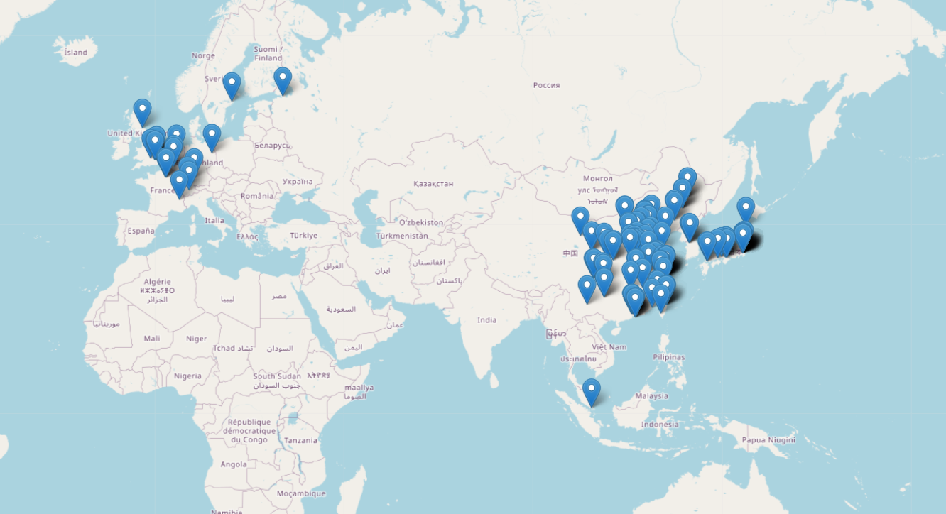
With Jingyuan’s geo-visualization module here as an example, users can pinpoint exactly where artifacts are stored, find the number of pieces at each location, and identify key regions of concentration. And the underlying map layer used is based on Google Maps, which can be panned and zoomed interactively.
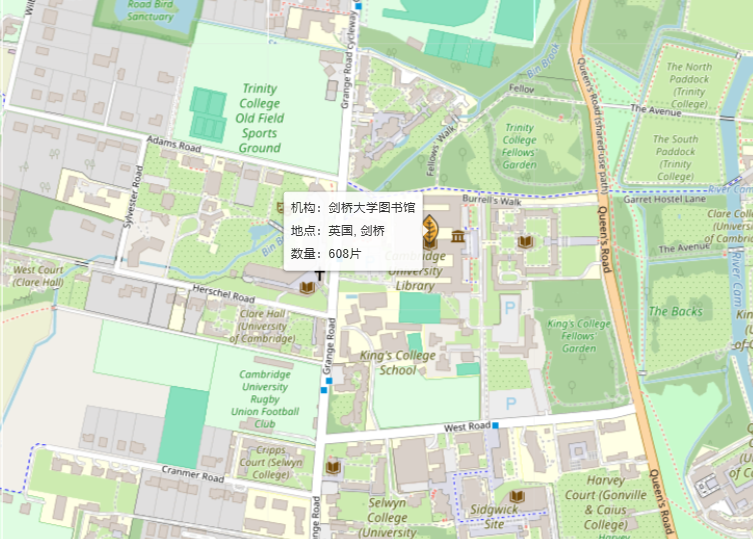
Apart from that, the module also provides further interactivity: when hovering over each marker, custom information – typically text descriptions or images associated with each location – can be displayed in a detailed pop-up like this:
In bringing the Jingyuan platform’s geographic visualization module to life, I have used Leaflet, an open-source JavaScript library tailored for interactive map creation on the web. While other tools like R, Maphub and TimeMapper, can also be used for achieving similar visualizations of geo-spatial data, they often excel in offline map creation and static visualizations, as commonly seen in articles and research papers. Leaflet.js, on the other hand, stands out for its JavaScript framework integration, fast performance and easy adaptability, making it well-suited for building interactive maps for standard web applications. With Leaflet.js, users can interact seamlessly with an online map interface, allowing them to quickly pinpoint sites, access collection details, and visualize more than thousands or even millions of artifacts, figures, events across global locations, which would not be possible in static maps (another relevant post can also be viewed here for more details and usage of leaflet.js).
Additionally, Leaflet now supports direct use with Python and R, providing further accessibility for data analysts and researchers working within those environments. In the following sections, I will explore in greater detail the steps of data preparation and the coding processes needed to map geographic data effectively with Leaflet for a robust web application.
Preparing the Data
In any visualization task, both data and its format are crucial when dealing with issues such as accessibility and performance. While there are more complex and intuitive formats designed especially for geo data (like GeoJSON), which support a wider range of spatial features such as polygons and multi-layered point data, these formats come at the expense of additional setup and processing. With Leaflet, however, you can start with a simple data sheet, like an Excel file, to structure your data efficiently and accessibly:
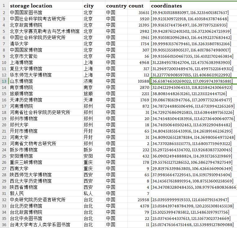
In this datasheet, we are setting up some of the most basic fields like storage location, city, country, artifact count, and coordinates for each collection. As data accumulates, additional columns for links to institutions, detailed notes, descriptions, or even images of storage sites can be added.
In order to obtain the coordinates (longitude and latitude) for each location – the only essential part we really need for mapping out the data – you can manually retrieve them using Google Maps or Baidu Map. In google map, after locating the site, right-click on the precise location to reveal the coordinate info:
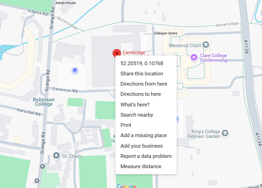
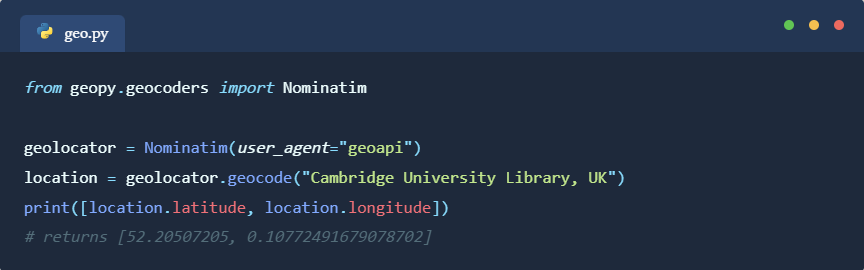
Just copy and paste the numbers into the Excel file (in a list format like above or two separate columns). This method offers a higher accuracy, usually within a ~10-20 meter range, and would work really well with smaller datasets. For larger datasets with hundreds or thousands of entries, however, it might prove far more efficient to automate the process. One solution is to use the Nominatim API which is based on OpenStreetMap data, to programmatically gather coordinates in bulk (also see Anna’s post). Just execute the following code in Python to obtain the coordinates for a place:
Or we can import our local Excel data and process all locations in one single batch:
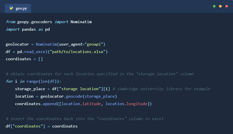
It should be noted that with this method, compared to using Google Maps, the location data may be less accurate and we do not have finesse control over the precise selection of location when it comes to places of similar names. But in terms of larger datasets, this would be the preferred way to go about it and we can correct any mistakes manually afterwards.
Coding with Leaflet with HTML/JavaScript
Now, to build our web page with leaflet and apply the location data from Excel, I would recommend using a Nuxt.js or Next.js framework which streamlines the process of building web applications. They come with their own node.js servers, testing environment, and backend API integration methods which would significantly enhance the relevant coding experience.
However, if we are not looking to build a dynamic web application with fancy data rendering and interactivity or complex backend capabilities, just using normal HTML and JavaScript files also works. To build a leaflet app, we can start with a basic HTML template, defining the page that we want the user to see as an interface:
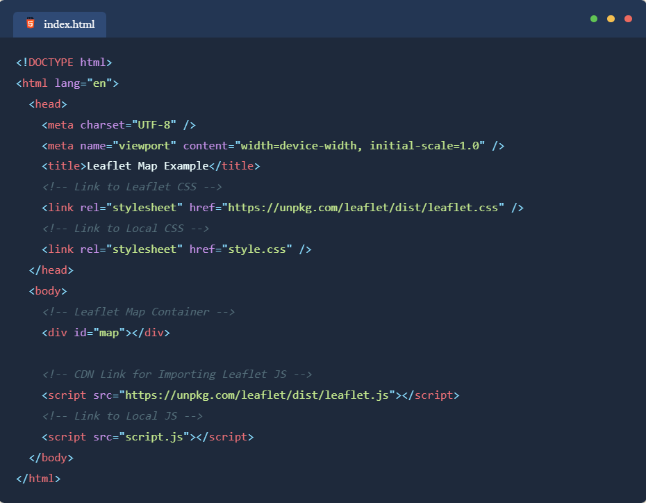
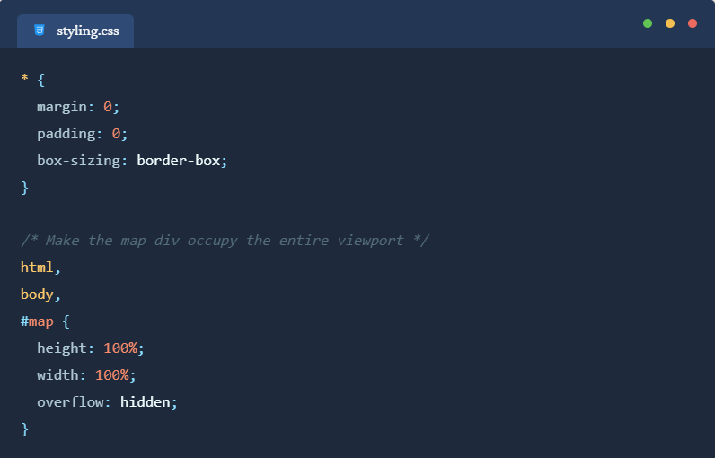
The <head> tag defines the meta information for the web page like page title, and imports Leaflet package from a remote source. As for the <body> part, we just put a single <div> element to display the map. We can then add some CSS code for styling the page. For now, we just need the “div” element (with ID of “map”) containing the map to occupy the entirety of the screen:
After creating the above two files in any folder on your computer, when you open the “index.html” with your default browser, it should be showing a blank page. This is because we have not yet specified anything with Leaflet yet. To initialize the module and import the data we prepared, we can define the logic with a JavaScript file:
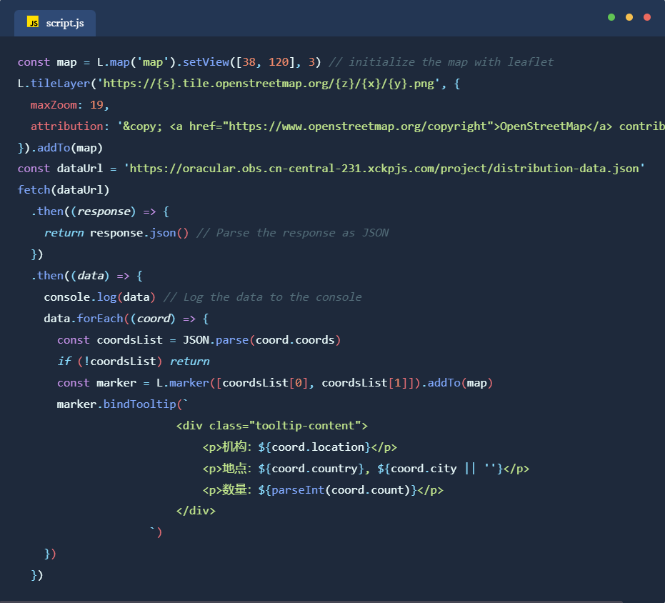
“L” is the arbitrary reference to the leaflet package. For this example, we are using an open street map for the underlying title layer and a loop to bind each data entry to a pop-up tooltip component. Now, as you open the “index.html” file, you should be able to see the map and tooltips displaying normally:

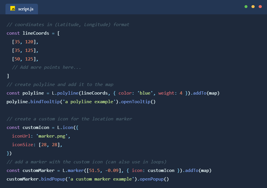
And these three files are really all we need to map out complex data in a browser! No matter the quantities or complexities, the leaflet.js will handle them automatically for us. It also provides robust customization options, allowing users to draw basic shapes like lines, rectangles, and polygons on the map, as well as change markers with custom icons or even site images. An example of drawing polylines and changing marker icons is shown below:
Note as we are using HTML, CSS, and JavaScript only, which is a static app in nature, data importing part will not be very easy to implement, especially with local Excel or JSON files (as “fetch” method requires a node.js server to work properly, which is why I would recommend using frameworks like nuxt.js which offer these out of the box). In the above example, we just use a tentative fetch API to an online data file (published on my own server here) to load the data and process them from there. Usually for web data exchange, JSON is the preferred file format to use. Excel also works in this scenario, but it would require additional JS packages to process. To convert Excel into JSON, we can also use online tools or Python packages like pandas.
For convenience, I have published the aforementioned code on GitHub. One can refer to the setup and download the code from here. I hope this guide, using Jingyuan platform’s visualization of oracle bone collections as an example, can prove helpful for displaying complex geospatial data in a browser environment and for offering a quick and easy solution for interactive mapping with Leaflet.js. For those interested in exploring similar tools, other JS libraries such as ECharts (for interactive charts with various styling options), Mapbox GL JS (for 3D map visualizations and high-quality basemaps), D3.js (for highly customizable data-driven maps and visualizations), are also powerful options worth considering. These libraries offer diverse features that can extend or complement geospatial visualizations based on the project’s needs, especially for those with web application development as final goals.

2 thoughts on “Jingyuan Digital Platform – Font Making and Database Development for Shang Oracle Bones (Part 2)”