
One of the biggest challenges of working with large (and often incomplete) collections of data lies in how best to understand and utilise them. How can we locate the trends, patterns, and relationships they contain? While spreadsheets are invaluable for storing and organising information, they can often obscure the bigger picture. Visualising the data within them allows us to move beyond rows and columns, showing connections that might otherwise go unnoticed.
A recent DO post demonstrated how Ottoman migration can be visualised and better understood using Flourish. Here I will share a similar experiment using RAWGraphs to show how basic visualisations can be a useful entry point for exploring historical and textual networks. These visualisations were created for a presentation on data from The Dawn of Tibetan Scholasticism (11th-13th c.) (TibSchol) project, and what this data suggests about the early scholastic landscape of Tibet. While I used multiple tools, including Gephi, to explore and present trends, this piece will focus on RAWGraphs due to its accessibility and range of visualisations on offer. For those new to data visualisation, RAWGraphs provides an intuitive starting point to translate raw data into meaningful insights.
Creating a Sample Dataset
Collecting information on the provenance of Tibetan manuscripts presents particular challenges. Key details, such as the places and dates of production or the individuals involved (e.g., scribes and sponsors), are often scarce or missing entirely. By collating and analysing what data is available, we can begin piecing together what we can to gain a better understanding of the period.
A sample dataset was compiled as part of ongoing efforts to investigate persons, schools, and networks in early Tibetan scholasticism, alongside the constitution and diffusion of early scholastic literature. The data is mostly from the bKa’ gdams gsung ‘bum (བཀའ་གདམས་གསུང་འབུམ།), a collection of writings from the 10th to 15th centuries, which forms a large part of the project corpus. This is supplemented with other primary and secondary works, such as the ‘Bras spungs dgon du bzhugs su gsol ba’i dpe rnying dkar chag (འབྲས་སྤུངས་དགོན་དུ་བཞུགས་སུ་གསོལ་བའི་དཔེ་རྙིང་དཀར་ཆག), a catalogue of the texts housed in five libraries at Drepung monastery.
The dataset contains 853 works by 172 identified authors, resulting in over 28,000 data points across 33 columns. The information collected includes:
- Author details: Name, alternatives names, date of birth, date of death
- Persons involved in production: Scribe, sponsor
- Places linked to composition and production
- Topics of works
What is RAWGraphs?
RAWGraphs is an open-source web application developed in 2013 by Giorgio Caviglia, Giorgio Uboldi, and Paolo Ciuccarelli at the Politecnico di Milano’s Design Department. Its goal is to bridge the gap between raw data and clear, compelling visuals, providing a simple interface and around 30 chart types. This makes it particularly suited to complex datasets and multidisciplinary applications.
Key features include:
- Accessibility: The tool is easy to use, even for those without prior experience in data visualisation.
- Privacy-focused: All work happens in the web browser with no server-side storage or operations.
- Customisability: While customisation options are limited within RAWGraphs, visualisations can be exported as SVG files for further editing in tools like Inkscape.
- Extensive resources: The platform provides tutorials, guides, and a FAQ page to support users.
While RAWGraphs is beginner-friendly, those seeking advanced customisation may find it less versatile than tools like Gephi. However, its simplicity and functionality make it an excellent starting point for exploring data.
How to use RawGraphs
Using RawGraphs itself is straightforward and has already been introduced in detail in a post by Özge Eda Kaya. In a nutshell, there are five main steps:
- Load your data: Copy-paste, upload a file, or load directly from a URL. Data parsing options are also available once the data is loaded.
- Choose a chart: Charts are grouped into categories (e.g., “Networks” or “Time series”). Each chart comes with a brief description, links to its code, and tutorials.
- Mapping: Assign spreadsheet columns to the visual variables of your chosen chart. Variables are mandatory or optional, depending on the chart.
- Customize: Adjust colours, dimensions, legends etc. Customisation options vary by chart type.
- Export: Save your visualisation in formats such as SVG, PNG, or RAWGraphs. The latter allows you to revisit and edit the visualisation in RAWGraphs later. Note: There is no option to save your work in the app itself.
Although the interface is intuitive, for those who are new to data visualisation, the choice of templates can be daunting; I would recommend filtering by category at first and viewing the related tutorials to get a sense of the types of data that can be best displayed by charts of this type. Ultimately, I had to play around with different templates and variables to get effective results, which is exciting when it works and frustrating when it doesn’t quite produce the expected results.
RAWGraphs in Action
These examples are not meant to serve as a comprehensive guide to RAWGraphs or as in-depth analyses of the findings. Rather, they offer a glimpse into the kinds of visualisations that can be produced and demonstrate its potential for mapping trends and connections within datasets. Two examples are featured here: a Chord Diagram, which presents scribal-author relationships from the sample dataset, and a Circle Packing chart, which showcases place-work links.
Chord Diagram: Scribal-Author Connections
The Chord Diagram is designed to show relationships among nodes, with node sizes representing the sum of incoming and outgoing links. Relationships are depicted as arcs, with widths proportional to their values.
Data Used: “Source” and “Target” (Author and Scribe), and “Size” (Weight: the number of instances of a relationship).
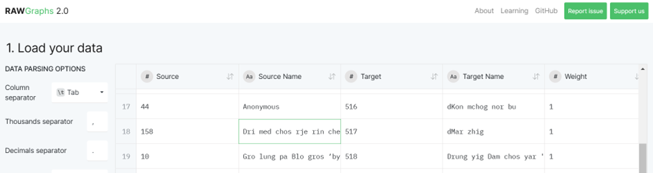
An example of the data used for the Chord Diagram.
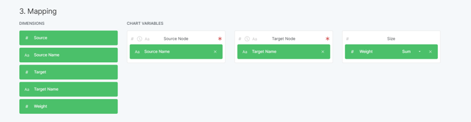
The chart variables selected for the Chord Diagram. Variables with a red asterix are mandatory.
With only 54 works (approximately 6% of the dataset) mentioning a scribe in the colophon, the visualisation immediately highlights the scarcity of this information. Many author-scribe relationships appear one-to-one, but some scribes (represented by grey outer circles) worked with multiple authors (represented by coloured outer circles), indicating more complex networks that merit further analysis.

Chord Diagram of the 54 author-scribe relationships captured in the datset.
Although this chart might not appear impressive by itself, adding temporal and/or geographical data could identify periods and places of intense production or significant collaborations. Additionally, it serves as a useful basis for creating a larger network analysis incorporating other relationships such as author-sponsor and teacher-student.
Circle Packing: Mapping Institutions
Circle packing uses nested circles to display hierarchical data, with circle areas corresponding to values.
Data Used: “Hierarchy” (Place > Author > Work) and “Color” (Place).
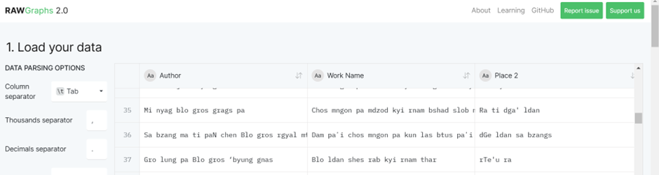
An example of the data used for the Circle Packing chart.
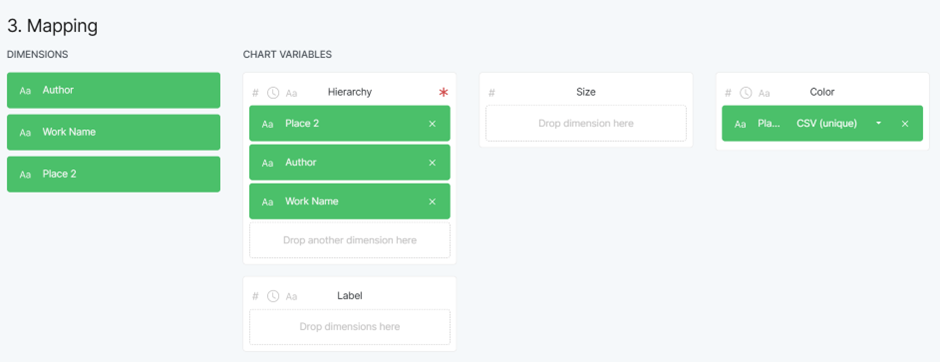
The chart variables selected for the Circle Packing chart. Variables with a red asterix are mandatory.
This visualisation provides a useful geographical perspective, highlighting the spatial distribution of works and authors. The first layer of circles represents different places, the second layer showing authors, and the smallest circles representing works by the author (the larger the circle the more works produced by the author in that place).
The nested structure shows:
- The geographical spread of scholarly production
- Connections between places and authors
- The volume of works produced in different places, suggesting concentrations of scholarly activity in specific institutions
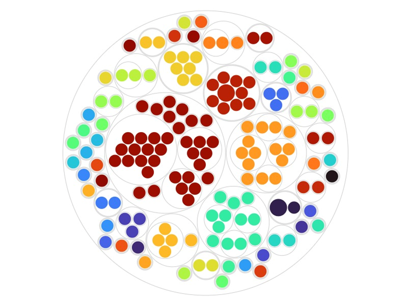
Circle Packing chart presenting the 159 instances of work-place relationships.
While the places with the highest concentration of works and authors are unsurprising, as these are institutions linked to early scholastacism, the chart also draws attention to other potentially significant hubs. Integrating temporal data could give an idea of how these institutions flourished or waned over time. Adding the main topics of works as an additional hierarchy in the chart could also show us whether institutions had specific areas of focus.
Conclusion
While these initial graphs are relatively simplistic, they demonstrate the potential of data visualisation to present relationships and patterns that might otherwise remain obscured in textual or tabular forms. As more data points are collated, the connections that graphs such as this show should become clearer and help to illuminate trends and/or particular areas of focus.
Adding additional fields to the analyses, in ways such as those suggested above, can provide additional layers of insight. By visualising broad trends while enabling more targeted analyses, we can gain a multi-layered understanding of historical and textual networks. Despite lacking some advanced capabilities, RAWGraphs is a useful tool for exploring and visualising data quickly and effortlessly.
References
bKa’ gdams gsung ’bum phyogs bsgrigs thengs dang po/gnyis pa/gsum pa/bzhi pa. 120 vols. Edited by dPal brtsegs Bod yig dpe rnying zhib ’jug khang (Chengdu: Si khron mi rigs dpe skrun khang, 2006, 2007, 2009, 2015).
’Bras spungs dgon du bzhugs su gsol ba’i dpe rnying dkar chag. 2 vols. Edited by dPal brtsegs Bod yig dpe rnying zhib ’jug khang (Beijing: Mi rigs dpe skrun khang, 2004).
Cover image: “Processing 06” by Carsten, via Flickr, licensed under CC BY-SA 2.0.

One thought on “Beyond Rows and Columns: Visualising Data with RAWGraphs”